APRIL 2025
Scope: Redesign & Digital Strategy
Duration: 2 weeks
Role: UX Researcher, Interviewer, Survey Designer, UI Designer
Tools:
Co-collaboration: Alexandra Payotte
Case Study: Here
Kickoff & Reconnection
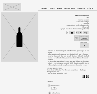
Create a unified digital presence for Château Rouquette sur Mer—a family-owned vineyard nestled by the Mediterranean Sea. The project called for more than just a redesign: our goal was to merge two existing websites (one for e-commerce and one informative) into a cohesive experience that could meet the expectations of loyal clients while also appealing to international visitors and wine lovers.
Alexe had strong knowledge of wine, while I was new to the field — on top of that, I’m intolerant to wine. That irony aside, I found myself enjoying the research, especially with my Portuguese and Alentejo roots giving me a deeper cultural connection to the topic. It was a reminder that even unfamiliar subjects can become fascinating when approached with curiosity.
Researching a World I Knew Little About
What we had
After conducting the stakeholder interview, François send the team all the assets: logos, product images, vineyard photographs and analytics. But for now we would only focus on the analytics so that we could focus on the research. During the interview François made an assumption "People dont buy wine online" and. this was a key point to start.
→ French clients rarely shop for wine online, and when they do, their primary concerns are delivery fees and the inability to taste before buying;
→ What matters most to them? Price, clarity of wine description, and desktop usability;
→ Across all respondents, tourism and wine tasting emerged as common interests.

We received an impressive 233 responses overnight, with 214 from current clients.
While we were thrilled by the volume, we quickly realized the imbalance: only 16 responses came from non-clients, far too small for comparative analysis. But rather than stall, we decided to focus on client data. Our time was limited, and this pivot allowed us to move forward decisively.
50% were 65 or older;
78% lived in France;
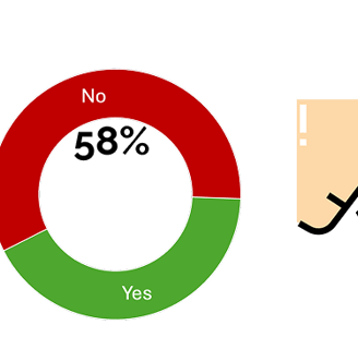
58% said they don’t buy wine online;
Top barrier: “I need to taste the wine first”;
Top motivator: “Tasting information”;
Most used device: Desktop (42% from 90 responses)
Results & Affinity Diagram
Defining the problem was trickier than expected. While François’s objective was clear — merge two sites — the users’ problem was harder to pinpoint. Most weren’t actively asking for a new website. But through our research, we uncovered a core tension, and the problem began to take shape:
How might we recreate the emotional, sensory experience of wine tasting in a digital environment — so clients like Julien feel confident enough to purchase online?
“I could really go for a glass of wine right now.”
The goal was to make people feel
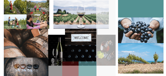
We chose to retain some of the original colors and focused on bringing the brand attributes to life: family estate, exceptionality, quality, artisanal craft, and a warm, welcoming spirit.
This time, instead of merging our design ideas, Alexe and I created each our own wireframes and concepts — something encouraged by the stakeholder, who wanted two different designs.
Each of us created both lo-fi and mid-fi wireframes, and conducted concept and usability testing respectively. The final days were intense and highly focused — we were refining our designs, running tests, improving prototypes, and preparing the final presentation all at once.
As you will noticed, a lot of changes occurred between the mid-fi and the final version. These were driven by:
Feedback from concept and usability testing: adding buttons on product cards to improve interaction.
Iterations and heuristic analysis: refining layouts, usability patterns, and overall flow based on design principles and personal evaluation.
Collaboration with my teammate Alexe: added filter by color feature from her design. Although we worked on separate versions, we collaborated closely and exchanged ideas throughout the process.
Sometimes things don’t turn out exactly as we imagined — and that’s okay.
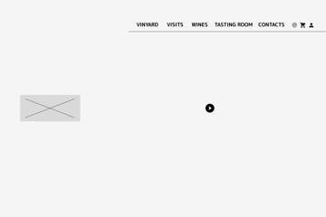
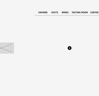
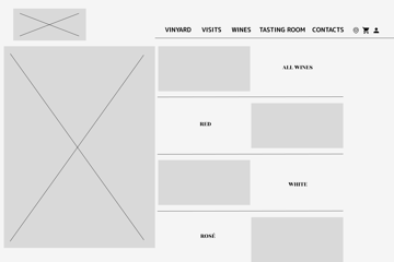
Hi-Fi Prototype
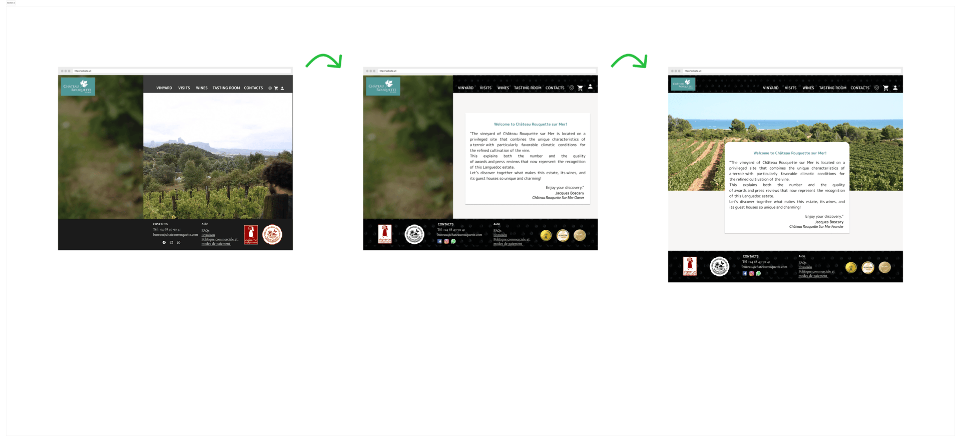
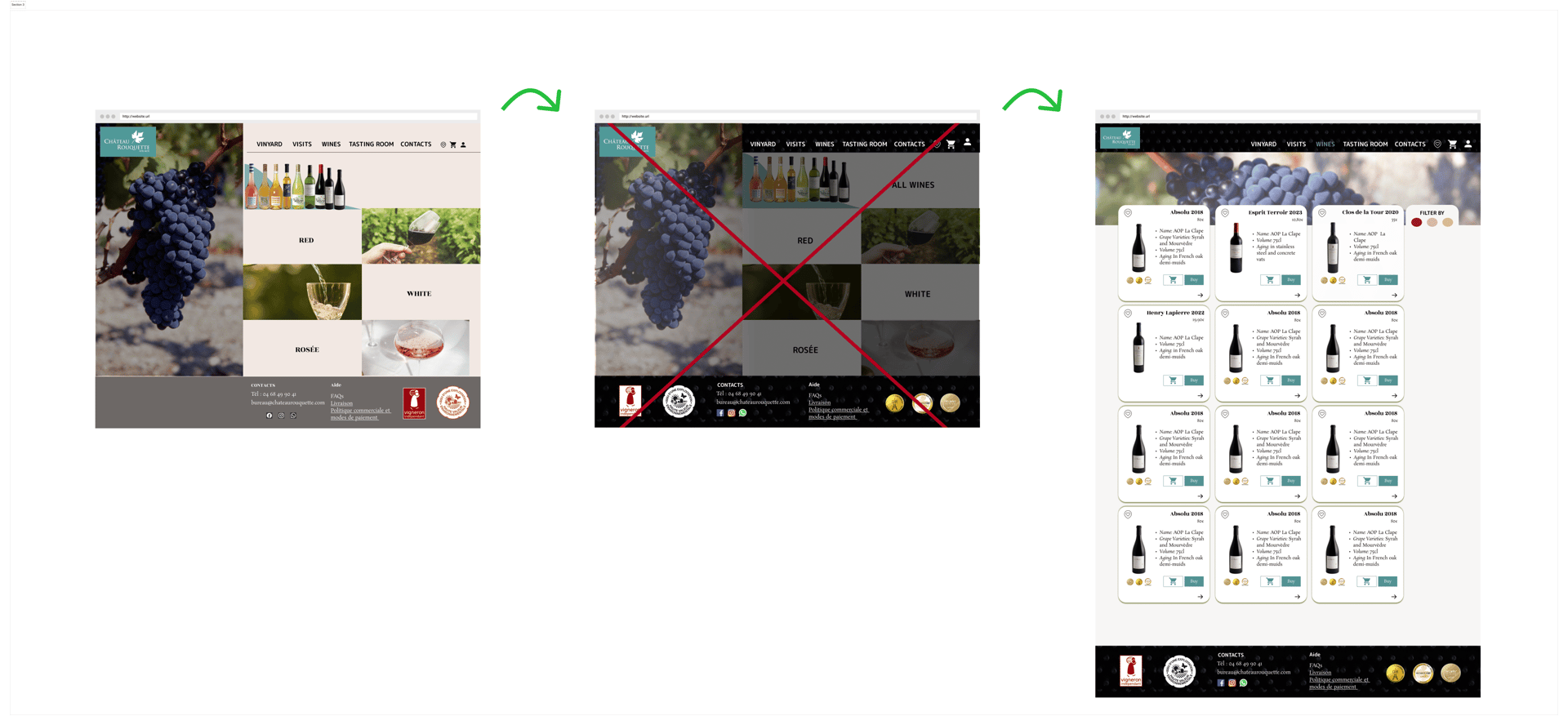
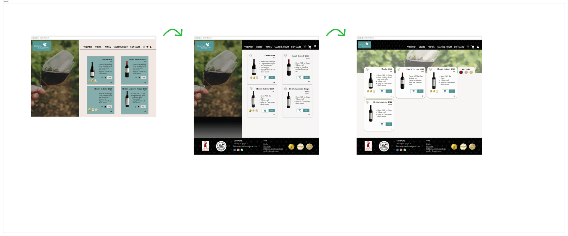
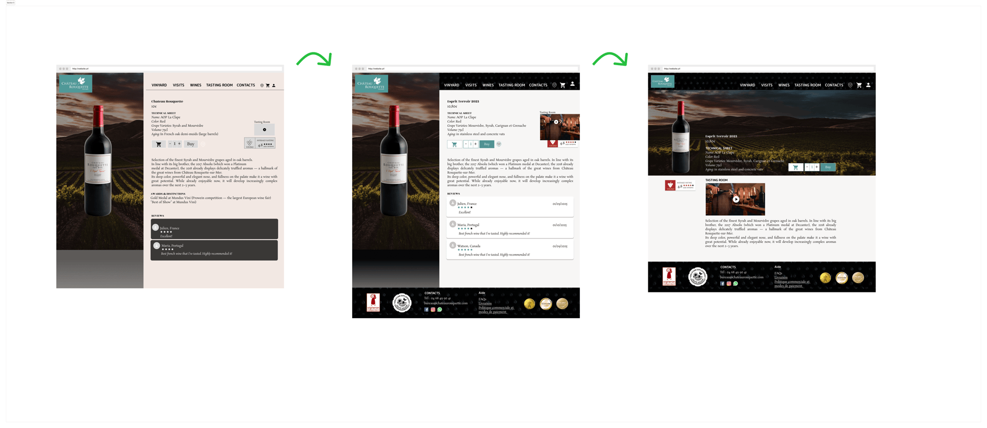
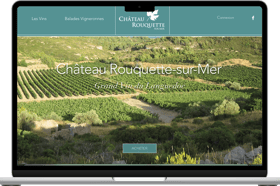
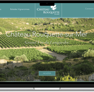
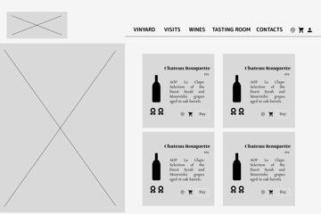
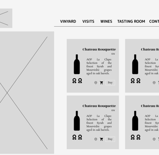
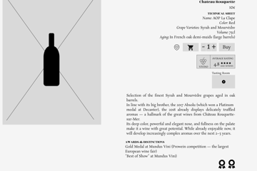
Example of three versions (2, 5 and 7) of my Hi-Fi prototype changes along four main pages: Homepage; Wines Page; Red Wine Page and Product Page
I started with two stock videos (not from Château Rouquette). Then I remembered that François really wanted to evoke a sense of family and welcome, so I went back to the original website and used the welcoming message from his father, the founder of the brand. However, the side video felt distracting, so I replaced it with an image of Château Rouquette alongside the welcoming message to bring authenticity. If I had a video of the château, I would probably replace the image with it.
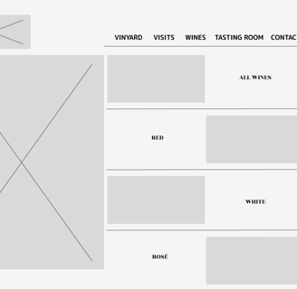
I was so focused on the visual impact that I initially thought clients would want to immediately choose between red, white, and rosé wines using a categorization or filter. But after discussing it with my teammate and seeing what she had done, I decided to replace that with an "All Wines" page, where clients can first browse the full selection and then filter by type using a color filter.
The images on the left side were initially added to give the page more of a presentation or brochure feel. However, the dark-toned, textured header combined with the image created a visual imbalance. So, I decided to prioritize the texture over the presentation style. I moved the images to the top of the page and overlapped them with the product cards. This change led me to rethink the product page layout—both the imagery and the organization of the information—and I was really happy with the final result.
After the lo-fi, mid-fi, and six iterations of the hi-fi prototype, I arrived at this final version
Future & Ifs
Conduct more desirability testing;
Gather additional non-client data;
Explore research findings: We noticed differences between French clients and non-French European users in terms of age range, devices used, and purchase motivations;
Investigate online wine buying behaviors: Do users prefer purchasing wine directly from vineyards or through online wine marketplaces like Vivino?
Reflections
This project felt like a true culmination of everything I’d learned during the bootcamp:
User-Centered Design: We let real feedback and patterns guide our ideas;
Flexibility: When non-client responses were low, we pivoted our strategy and adapted;
Teamwork & Communication: We leaned into our strengths while working independently and collaboratively;
Confidence in Presentation: For the first time, I felt like I had truly mastered presenting research — visually and verbally.
Key Takeaways
Merging websites is about more than structure, it’s about storytelling;
For sensory products, user trust requires emotional connection;
Assumptions should be validated, research adds clarity and confidence;
Design is most powerful when grounded in real user emotion.
Product Designer, Guided by Curiosity
Contacts
© 2025. All rights reserved. Design by MIACCAI