
Disney+ App Re-design
Heuristic Evaluation | 3 days | UX Researcher & UI Designer | Solo Project | Figma, Figjam
3/7/20252 min read
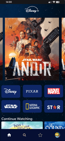

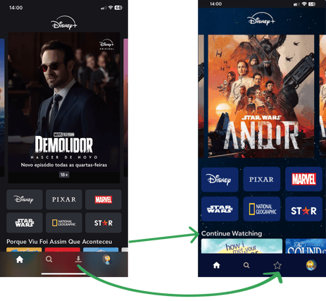
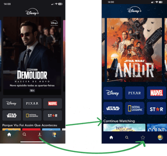
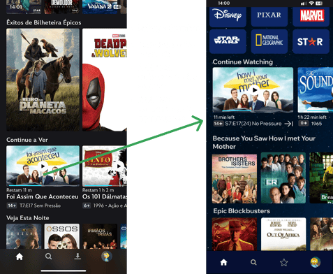
Disney+ is a familiar app to me and in this three days bootcamp project, I conducted heuristic evaluation, redesigned the navigation and onboarding flows, and created interface mockups that make content discovery clearer and more engaging for users.
Key Highlights
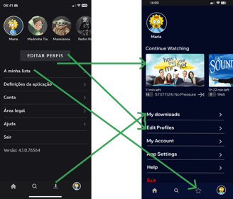
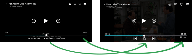
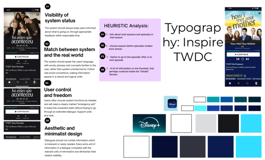
| Heuristic evaluation identified navigation complexities and repetitive content sections |
| Redesigned user flows for onboarding, personalized content recommendations, and profile management |
| Created high-fidelity UI mockups in Figma, focusing on clean layouts and Disney‑aligned visual aesthetics |
| Employed FigJam to sketch ideas, plan screens, and iterate on user flow concepts |
| Goal was to enhance usability, reduce friction, and make user navigation more intuitive |
| Conceptual prototype — next steps could include user testing and iteration based on feedback |
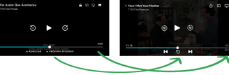
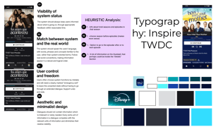
Heuristic Evaluation
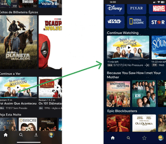
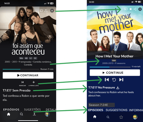
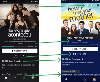
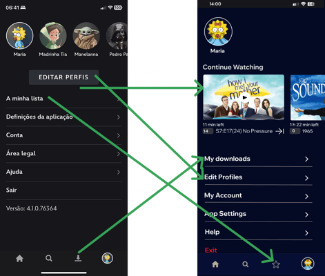
The main point of creating something with room to grow is exactly this: the opportunity to look at it and apply changes, whether small or big, simply to make it better. Often called an update, and as long as people remain at the center of any experience, there will always be room for growth.
Product Designer, Guided by Curiosity
Contacts
© 2025. All rights reserved. Design by MIACCAI